Writing

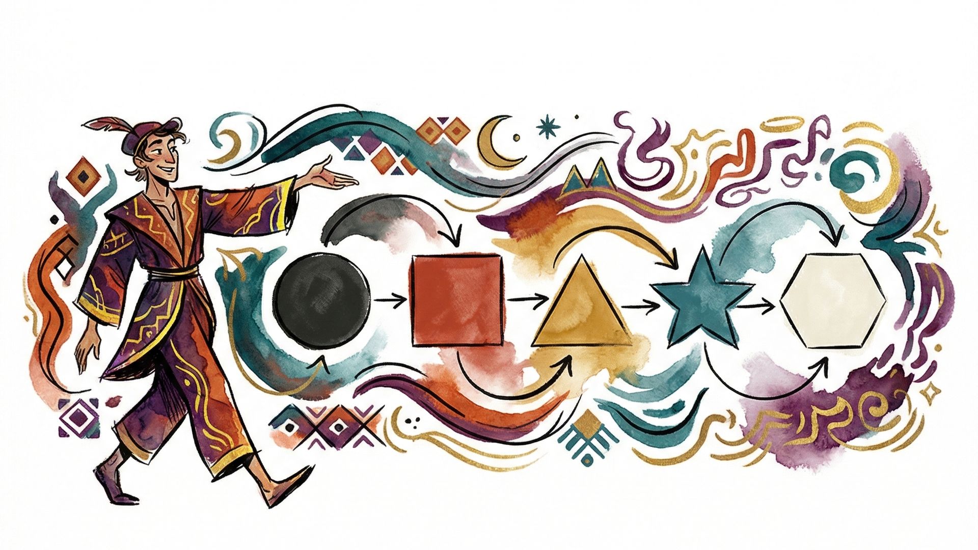
26 Years In: The Best Time Ever to Build Apps

I Used to Hide My iPhone at Microsoft. Today I Shipped an iOS App.

Voice-over roulette

The Best Parts of Your Job

How I Found My SOUL.md and Stopped Cosplaying as an Enterprise

Gardening day
Ship two
Using AI surfaces what's only in your head

Zero to Thirty-Three
Four Days, One Product, and the Part That Actually Made It Work

Bookmarks Are Where Good Content Goes to Die
Don't Expect Humans to Act Like AI
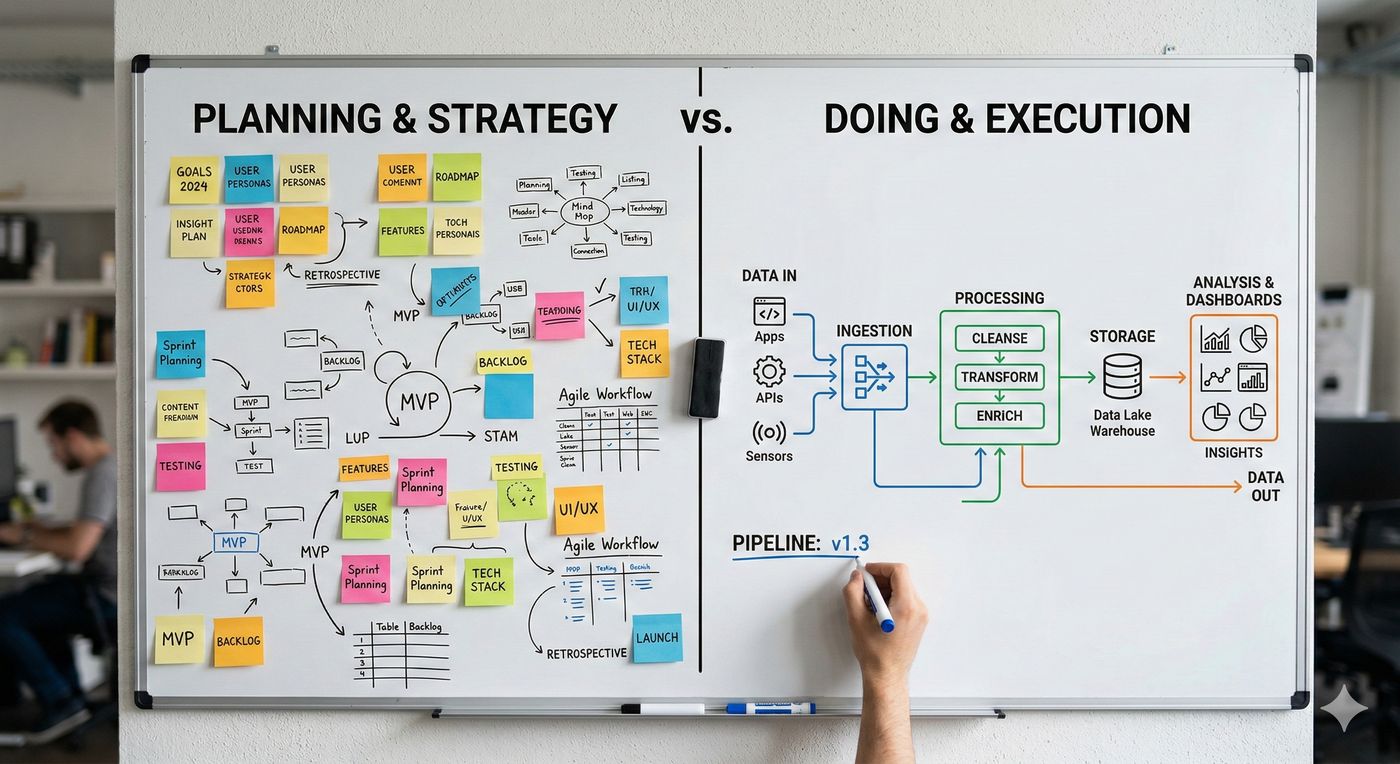
The Pipeline That Pays for Itself
Eight Dimensions of AI-Native Design

Most Tokens Burned

The Workshop and the Clones
Thanks for the Advice

Surgery on a Running Mind
The App That Wasn't

The Wave Is Moving
After the Slide Deck

Year of the Frontier Firm

New Role, Same Gap

How I'm Using AI to Bring My Kids' Stories to Life

Why Code Is More Precise Than Natural Language

Claude + Cursor - The AI Pair Programming Dream Team

When AI Code Looks Good but Grows Like Cancer

The Mirror, the Lie, and the Breather

How I Built a Ghostbusters Team of AI Agents
From Code to Conversation, AI's Unexpected Value

Starting Fresh as an Independent AI Engineer and Creator

First royalty check from elevenlabs.io

Building a Visual Cloudflare Images Manager with Cursor AI

ChatGPT told me this was art

Peer Programming with Cursor AI - Initial Impressions

Microsoft Learn founded in 2018, Docs in 2016

Using the Remix loader on server and client

Setting Up Cloudflare D1 for a Remix-Powered Project

From Skeptic to Believer - My Journey Into React and Remix

Father's Day Shirt

Daddy's hair is not black

First day at Stripe

Last day at Microsoft again

Penelope on the lake

remix09 European Tour

The First Big 9 Guy Sighting at PDC05

Little man on a PNW beach

Blue hair!

Pandora coming to Facebook
